Saturday, 8 February 2014

C&G Level 2, Module 2, Chapter 1completed

'How does your garden grow?'

Collecting images. 

Images were collected from my own photo collection from around the world and some magazines. They were then sorted into different types. 

First crinkly and spiky then rounded forms and some that didn't fit any of those categories but I liked them and a couple I though may be useful for tassels so added to keep them.


I sketched a few beside their pictures (pages 1-5 in my book)

I found a flower that I like a lot and have many in the garden. Hellebores are so varied and beautiful. I first sketched the flower and using black thread on backed calico, I made a stitched sample


The hellebore and drawing along with the stitched sample (Sample 1 page 6) 


The stitched hellebore

I enjoyed stitching this, dogs down and free embroidered on calico back with pelmet Vilene. It's difficult in black thread to reproduce the delicacy of the hellebore but as this was about form and stitch I simply defines the difference in colour between the petal and the edges. To create the stamens and centre meade the density of stitch more that the hellebore presents, but the exercise was interesting. I would take the stamens from the edge of the centre rather than the centre itself in future.  I did a little hatching in areas to depict shadows, but not too heavily.

Drawing with the needle.

I cut a stem of pieris from the garden and photographed it to create a flat image from which to stitch my sample. Using Cefyn Burgess's work as an example of how I might present this piece, I put calico in a hoop and stitched in black thread.

I like the simplicity of Burgess's work and the contrast between the black and calico. I drew the references from my photo to the calico although on reflection I should have drawn the plant onto paper and then to stitch. 


The Pieris, Cefyn Burgess example and my stitched sample. (page 7) 

I enjoyed making this sample and like the result. When I have more time, I would like to use this technique using cow parsley which is a great favourite of mine and stitch in different colours to create a fabric.

Then looking at Grinling Gibbons - what an amazing wood-carver. I love how he creates such realistic delicate objects so beautifully. I chose one of his carvings and took some of the elements to make a small sketch. 

I then made a collection of flower, leaf and seed pods from the garden and dried specimens that I had saved since last year and made a drawing. 
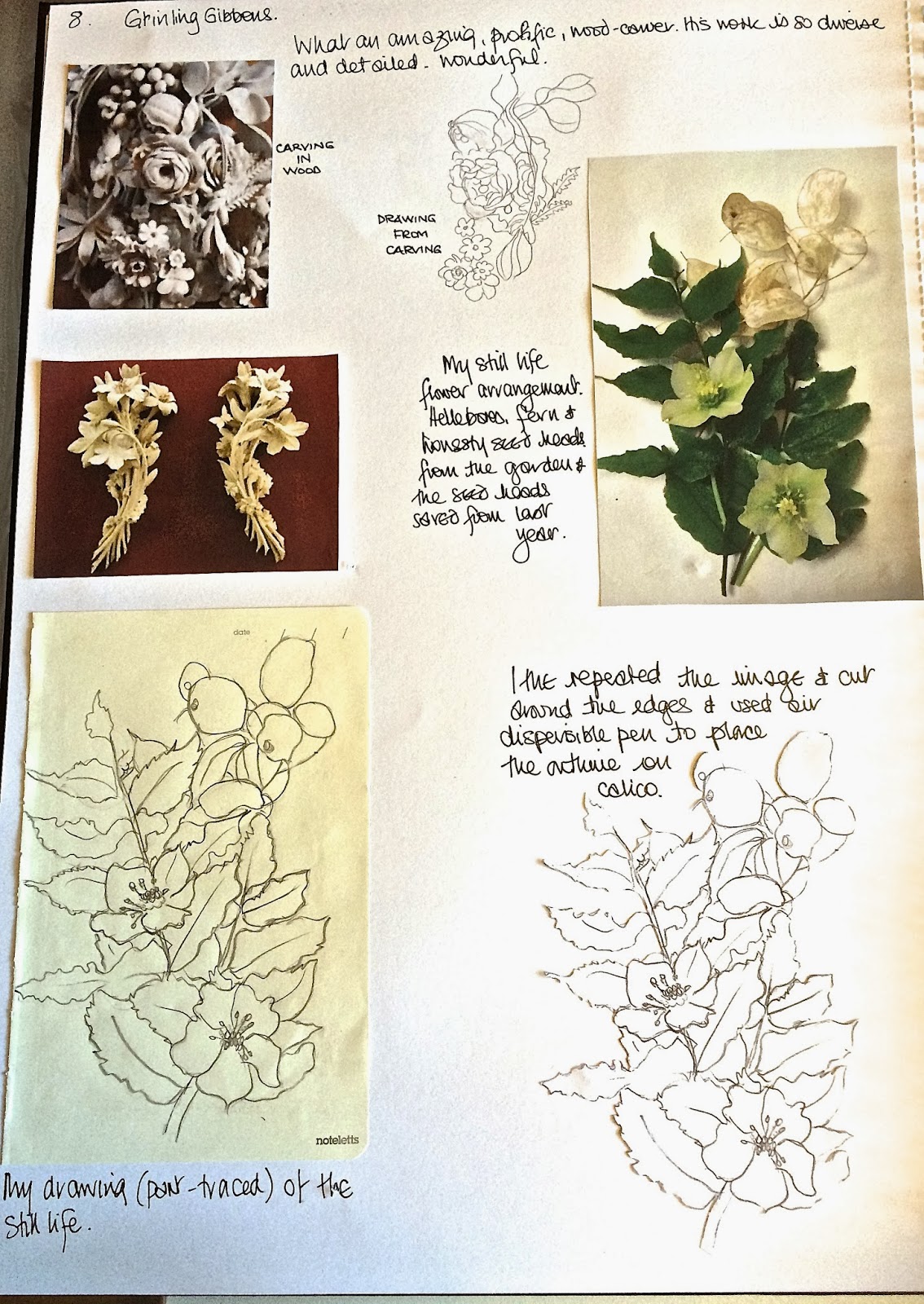

Flowers, leaves and seedpods (page 8)

Again using hellebores and a lovely fern which just seems to never die (it gets nibbled around the edges) and some honesty seed heads, I made a little still life study and a drawing. In order to transfer this successfully and maintaining dimensions to calico, I transferred the outline of a cut copy using air dispersible pen to calico backed with white felt. I then supported this in a hoop and stitched in black thread. 

Hatching was suggested as a possible for this image but I decided not to as I wanted to create the clean simple image as for the Burgess sample. I like this and the last piece very much.


Sample 3 (page 9)

Creating voids

This next exercise was to collect some differently shaped vases, jugs etc and make a drawing of them overlapping each other to create negative spaces. I did consider going to the charity shops to find some more appropriate items, but decided to use what i have.


My small still life collection (page 10)

I think that what this image lacks is height but decided that I could still do the exercise successfully with these. 

So, I made the drawing - the dimensions are not absolutely accurate but as the guidance states, this was not a drawing exercise! 


A simple sketch of the still life (page 10)

Then tracings were to be made of the drawing with elements of the image removed to create additional voids. I made several tracings trying to determine which would make the best example. 


My first tracings determining which I like best (pages 10 and 11)

Then using one of the tracings I coloured in blocks to decide on the voids. I did this on two tracings but even having decided which I thought would work best, I still changed it as I did the sample. 


Two blocked out tracings to determine voids (Page 11)

The image with voids was then transferred in reverse to Stitch'n'Tear and using white thread top and bottom the Stitch'n'Tear on the back of the felt. the image was stitched on the lines. 


Front of felt once stitched through from the reverse (p12)

The voids were blocked on another piece of stitch and tear as a pattern for stitching and using white ordinary thread top and bottom, dogs down, the image was transferred in grant stitch - love it! 

I had to do a little bit of modification as I went along. Probably because I needed different artefacts to begin with, (but it was 0600) there were insufficient voids to create the divisions but this was overcome by creating little elements of stitch to separate areas. 

I enjoyed this chapter very much and look forward to Chapter 2.


Saturday, 25 January 2014

C&G Level 2 Module One, Chapter 10 completed

Chapter 10 completed

Stitching colours, line and texture

The first exercise was to  draw lines on paper then stitch different lines onto black felt using a range of colours.

The doodles were done first.


The first three samples were then stitched with pink, turquoise and gold.


1. Stitched blobs and lines


2. Stitched spirals and lines


3. Stitched zig zags and lines

Then changing to red and gold thread on black felt, three more samples were stitched. 


4. Squiggles in gold and red


5. Spirals in gold and red


6. Wavy lines in gold and red

Then the colours were changed to purple and silver again on black felt


7. Circles in purple and silver


8. Spirals in purple and silver


9. Wiggles that look like 'ME" in purple and silver

My preferred colours were the first three as were the designs. I then did very small samples in a green and variegated metallic rainbow threads. 


10. Loops in green and rainbow metallic


11. Circles in green and rainbow metallic


12. Straight line doodle in green and rainbow metallic

Next, Pottery by Caulfield was considered.  Although not my taste, the image was interesting in it's use of perspective. From the bottom of the image, it looks as though you are looming into the pots and then looking towards the top of the image, it looks as though you are looking upwards. Clever. 


Asked how many shapes were found; I thought four. The vases, jugs, plates and urns. The lines are both curved and straight. Some same colours are close to each other, but not touching. 

The exercise was to draw shapes, curved and straight with lines going inwards and outwards, then a shape inserted, coloured and a line used as in the stitching exercise. Zingy colours were to be used.

The following two images are my results. I like them but wanted to do something different for my stitched sample


The following photographs are taken in a hotel car park in Nairobi and are made entirely from mosaics. I loved the shapes created and had them in photo files for reference. I particularly like the heart shaped curvy image top left and thought that this would make a useful image for this resolved sample. 


Photos from hotel car park, Nairobi, Kenya 2013

I drew the lines from this image onto paper and made a stencil which I then transferred onto pelmet Vilene

Then using my five chosen colours, I made four images using those colours in different way. The first two are above next to my drawing and stencil. The second pair are below. 


From the four images, I selected the predominantly yellow image to transfer to stitch and stitched the reversed design onto the Vilene and through to the black felt, with black thread to create a positive image on the front of the black felt.


Reversed image on stitched on Vilene


Positive image on front of black felt.

Then using my five colours and a range of lines and stitches, I created a representation of the original mosaic in colour and thread.


My resolved sample

I hope that I have done enough to have completed Module 1 and look forward to continuing the course. 

Saturday, 18 January 2014

Chapter 9, Module 1, C&G level 2 completed

Chapter 9. Playing with colours, building layers

The first sample was to use calico stabilised on white felt, dog up, foot on for automatic and zigzag patterns

Primary colours
This first piece was worked using primaries and zigzag in rows using different width stitches.


Primary colours using zigzag

These colours remind me of childhood, the seaside and summer. I think that the red seems to dominate the piece

The second sample is using the same primary colours but with an automatic machine pattern. I chose one of my machines loopy patterns 


Primaries stitched with an automatic machine pattern

Using the same primary colours and an automatic machine pattern, the second sample was stitched. The volume of stitches in the pattern flattened the fabric beneath and creates a more subtle piece where the colours seemed to blend together. This was probably because the edges of the criss-crossed design of the pattern intertwined rather than the abrupt edges of the zigzag pattern and would make a piece of work, more solid and subtle

Secondary colours
The same method was used, this time working with the complimentary colours. 

Secondary colours using zigzag

These colours are softer that primaries. I prefer these and if I screw my eyes, I can imagine fields of lavender with very orange earth! 


Secondary colours using automatic machine pattern

This piece was stitched with the same automatic pattern as for the primaries. Less like fields of lavender this time, bit still pretty and more subtle that the red, blue, yellow sample. The fabric is held down well and creates a solid piece of work.

Primary and secondary colours mixed

This piece was stitched using the machine's vermicelli pattern. 


Primaries and secondaries mixed using automatic machine pattern

I love it! It is soft, like a gentle tartan pattern and would be great for a clothing fabric. I used vermicelli which seems to draw the colours together and blend them well. 

The next sample was to be made using an automatic pattern again with primaries and secondary colours. 


Primaries and secondaries using a star automatic machine pattern

I wasn't so pleased with this result and should perhaps have repeated the design to create more density to the end result.

Colour grading

The following sample used all the shades of blue thread that I had and I graduated them throughout the blue range using a zigzag pattern. 


Blue range using zigzag

I had a bit of an issue with my tension which I have subsequently resolved but it was an interesting exercise as the blues at the top began to look purple and at the palest shade seemed almost white

Monet

The next element of the chapter was to take a piece of a Monet picture and re-create it in stitch. I chose a piece of St Giorgio Maggiore, Venice as my sample.


A scrap of the painting by Monet

I then used acrylics to paint 'in the style of Monet' (ish!) 


My representation of the Monet original 

The colours that I found were orange, yellow, pale, dark and mid blue, purple, and beige/white

I made three stitched samples of the image. My first was on calico stabilised with felt just to have a go. I used straight stitch and zigzag but wasn't thrilled with the result, which I didn't complete.


The first sample on calico

My second sample was on a transfer painted piece of felt. I used an image from Chapter 2 but with the dense stitching, it doesn't really show through.


Stitched with zigzag on transfer printed felt

I really like this sample and am please with the result. Zigzag seemed to work best to re-create the sense of water. 

The third sample was stitched on black felt. I was not so pleased with this sample but enjoyed the exercise.


Stitched on black felt.

I think that this could be used as a field of flowers - the black felt representing the soil showing through the stems and coloured flowers. 

and finally .......

Using two colours in the needle and blending or contrasting (e.g red and blue to make purple) I stitched the sample again. Great fun as with the double thread, the fill was quicker. 


after Monet....

I really enjoyed this piece, it really was like painting with the needle.