Picture gallery
I chose the following images as my picture gallery for the chapter - some related to 'Up, up and away'

Page 1. A piece of Paisley patterned Indian historic kantha work (folk art) and my drawing of some elements

Page 1. Up, up and away! Brollies.

Page 1. Up, up and away. Montgolfier hot air balloon

Page 2. An old piece of kantha work used as a colour source for fabrics for backgrounds
I used the piece of kantha quilt (folk art) as a colour source and using watercolour pencils (maker unknown) I tried to find the colours within a fairly limited selection.

Page 2. My best match for the colours from the kantha (watercolour pencils)
Then I used transfer paints to find the best match for the colours I had used.

Page 2. Transfer painted A4 paper (a bit wrinkly as I used a hair dryer)
I ironed the transfer painted paper onto a piece of polyester satin supported on Vilene. The paints never look like how they will turn out on polyester satin and selected the threads that I had a closely as I could to the colours in the source. Given that the source is several hundred years old, it wasn't surprising that I didn't get the same faded look as the kantha piece.

Page 2. Left hand - transfer paper. Right hand - ironed onto polyester satin. Along with the selected threads.

Page 2. The stitched sample
I realised half-way through this exercise that I had chosen to make too big a sample - A4 - and should have worked on a much smaller piece. I mounted the satin with the Vilene in my largest hoop and the elements where there is higher density of stitch is when I had to move the hoop to complete the large piece. I think that this looks untidy and not tonal, so am fairly disappointed with it. If I had to do this again, I would tone the colours down and work on a smaller piece with smaller stitches and in that way create a more tonal work. I worked the light tones over the darker and mid-tones, but don't think it works.
Moving on, to more stitched background - one of my design sources was the Eiffel Tower; (up and away - France). I chose to use the base of the legs as a shape and abstracted that to create a different image.

Page 3. The Eiffel Tower as a design source

Page 3. My thought processes from my notebook

Page 3. Taken further to develop a design
The bottom image could be taken further as a strap or edge. I then used a piece of black felt stabilised with Vilene and using the colours I had worked through in my notebook stitch the design.

Page 3. The stitched sample
My thoughts are that this would look interesting in different colours on different backgrounds and that the diagonals could be used in an interesting way.
Automatic patterns

Page 4. Automatic patterns on red velvet
I selected and automatic pattern and using a range of threads colours including silver and gold metallics was interested to see how they would work against the red.
Left to right.
Silver and gold metallics - these gave an Eastern feel to the work - sari like and rich
Blue and green - Reduced the 'redness' of the red
Acid green - was a good contrast colour with the red
The variegated thread is interesting as it occasionally disappears and leaves what appears to be an imprint rather than stitching on the velvet
Fabric backgrounds
Sheers - strips
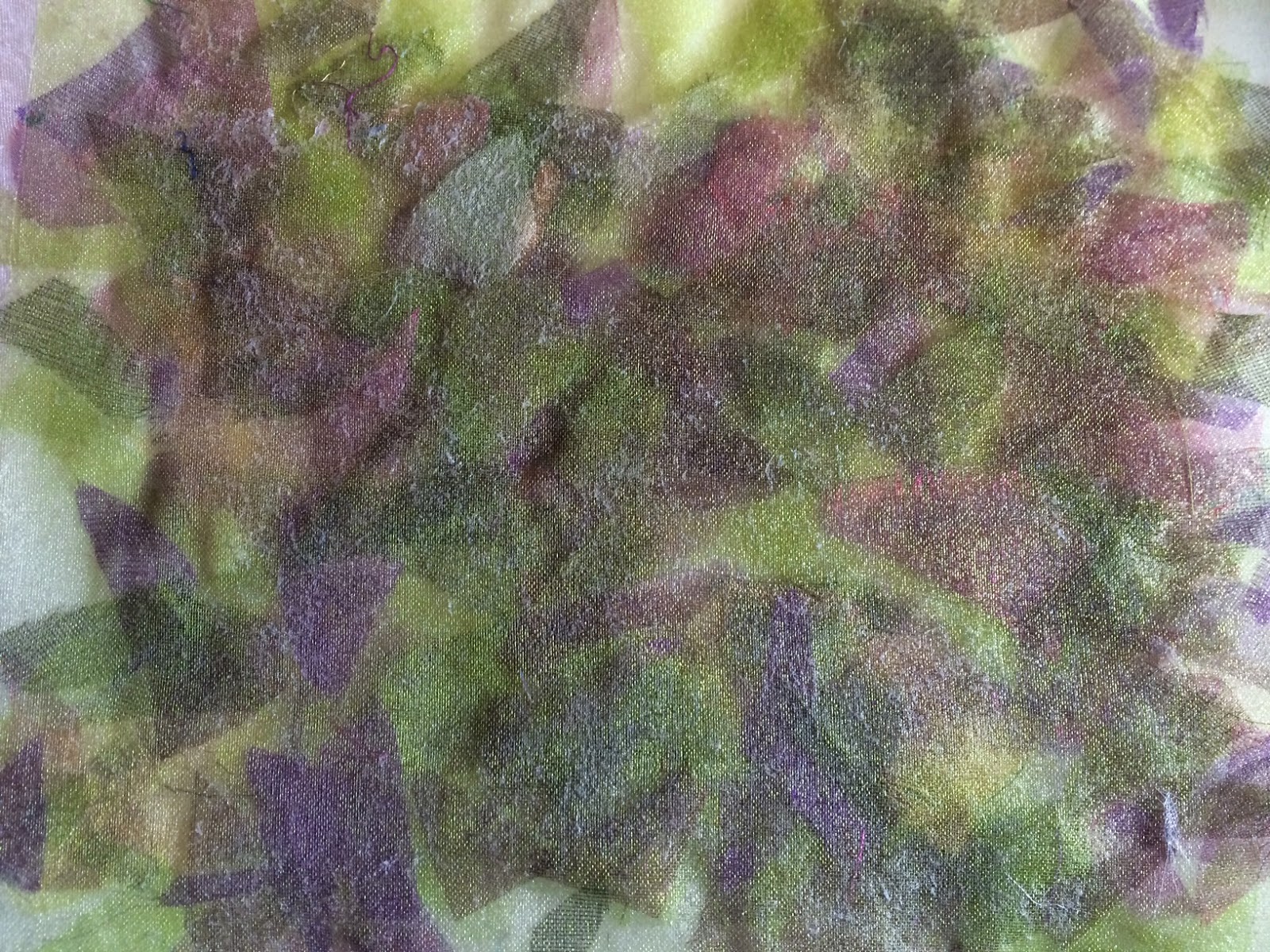
I made a sandwich of white organza, Bondaweb, organza strips in a range of purple tones, Bondaweb and purple organza.
These were all fused together using parchment paper and an iron, then areas burnt away with a heat gun. It made an interesting honeycomb-like effect.

Page 4. The purple side

Page 4. The white side
Sheers - snippets
I chose one white and one pale green layer of organza and ironed Bondaweb to each under parchment paper. Then between these layers, I laid snippets of organza and ironed them all together using parchment paper to protect the organza.

Page 5. The white side.
Page 5. The green side
Fabric snippets
Black felt and black organza were both fused to Bondaweb and layered with a sandwich of 'black' snippets of various fabrics, then fused together by iron on parchment paper.
The layers were then stitched with a grid of black straight stitch to create an interesting new fabric.

Page 5. The black grid sample
Some of the blacks verged on grey/silver but add interest to the sample.
Angelina
The base fabric is black felt with a layer of Bondaweb fused to it. With the backing paper removed, small pieces of Angelina were sprinkled onto the Bondaweb and with the protection of parchment paper, the Angelina and Bondaweb were fused together.

Page 6. Blue and pink Angelina fibres fused to black felt
Painted fusible webbing/transfer adhesive
A piece of cotton fabric was used as a base layer. Bondaweb was painted with silk paints and when dry the Bondaweb was fused to the fabric and then the new fabric was stitched with a toning thread in straight lines.

Page 6 The new fabric (above) and the original (below)

Page 6. The stitched new fabric
Printed and stitched background
Using the Paisley patterned kantha source as one design and the umbrellas as another, two blocks were made from funky foam and card

Page 7. The two blocks - left, the comma shapes from the Paisley pattern and the V shaped elements from an umbrella
Three colours of paint were used to block the fabric; yellow, mid green and dark green. The yellow was too loud so it was toned down with gold Markel stick.
Then stitching was applied; straight stitch was used around the gold triangular shapes, stain stitch on some edges of the dark green triangles and straight stitch around the 'commas' of the Paisley pattern.

Page 7. Top - original fabric. Bottom - The block printed and stitched fabric
This was an interesting chapter developing new fabrics.
No comments:
Post a Comment